Embedding Web Support
Follow this guide if you want to integrate your web support portal into your marketing website or other places on the web.
This article describes behaviors of Help Center 1.0. However, when you have Help Center 2.0, the behaviors are different. See Embed your web support portal in any web page.
Iframe Embed Code Generator
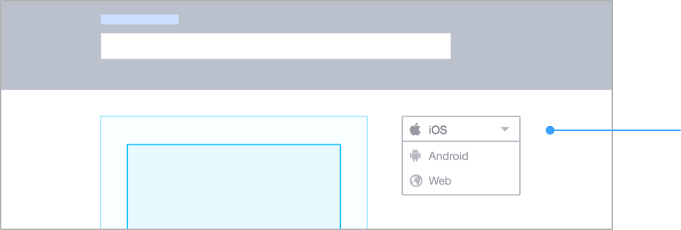
To bring up the embed code generator, navigate to Settings>Web Support and click Generate Embed Code in your agent dashboard:
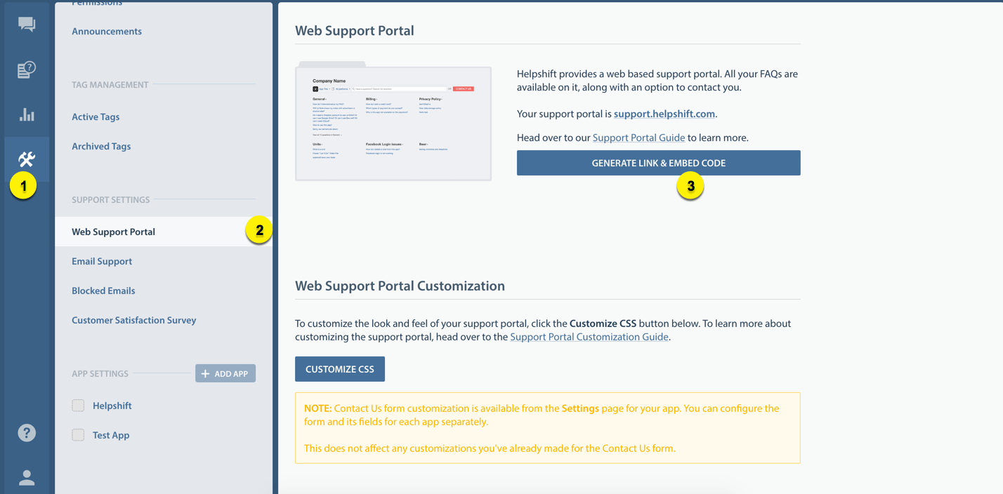
This brings up the custom embed code generator:
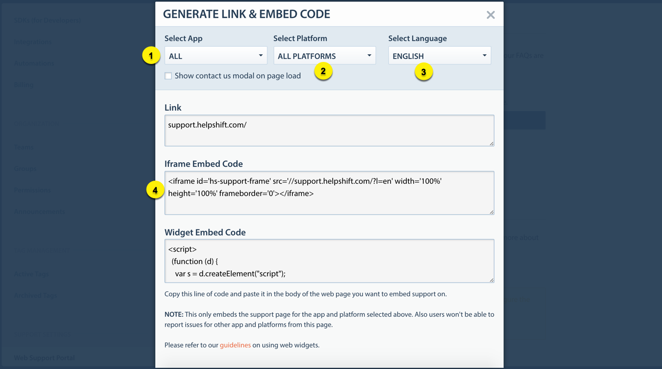
- 1 App Selection
- Set this if you want the iframe open a particular app. Doing so will also hide the app dropdown.
- 2 Platform Selection
- Set this if you want to limit your iframe to a particular platform. Doing so will also hide the platform dropdown.
- 3 Language Selection
- Set this if you want to open the iframe in a particular language.
- 4 Iframe Embed Code
- Click the textarea to select iframe embed code
Fullscreen support page embed
Use the following template for a fullscreen embed of your support portal. You can use this to provide dedicated support URLs on your domain, e.g. support.yourcompany.com or yourcompany.com/help/. This template also works for mobile browsers.
<!doctype html>
<html lang="en">
  <head>
    <meta http-equiv="Content-Type" content="text/html; charset=utf-8">
    <meta http-equiv="X-UA-Compatible" content="IE=edge,chrome=1">

    <!-- TODO: change this -->
    <title>Support - Happy Apps Co.</title>

    <!-- TODO: change this -->
    <meta name="description" content="Happy Apps Co. Support">

    <meta name="viewport" content="minimum-scale=1, maximum-scale=1, width=device-width">
    <meta name="apple-mobile-web-app-capable" content="yes">
    <meta name="apple-mobile-web-app-status-bar-style" content="black">

    <style type="text/css">
       html, body {
         width: 100%;
         height: 100%;
         margin: 0;
         overflow: auto;
      }
      .support-wrapper {
          overflow-y: scroll;
          -webkit-overflow-scrolling: touch;
      }
    </style>

    <!-- TODO: point this to your favicon -->
    <link rel="shortcut icon" type="image/x-icon" href="/path/to/your/favicon" />

   </head>
   <body>

       <!-- TODO: change the iframe's src to your Helpshift domain -->
       <div class="support-wrapper">
           <iframe id="support-frame" src="//YOUR_COMPANY.helpshift.com" frameborder="0" width="100%" height="100%" seamless ></iframe>
       </div>

   </body>
</html>
Make sure you edit the title and description meta tags.
You could also have this iframe point to a particular app or platform. To do so, replace this iframe tag with one generated via the embed code generator.
In-page integration
In some cases, you may want to retain your website's navigation and present the web support portal as a part of your content. We recommend the following setup:
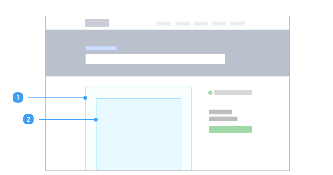
- 1 #support-wrapper
- A wrapper div for web support portal iframe, with id "support-wrapper".
- 2 #support-frame
- Your support portal iframe, with id "support-frame".
Keep your iframe inside a wrapper div, ID it as support-wrapper. You need not style the iframe. Let the frameborder, width, height, seamless attributes remain as it is.
Use support-wrapper to size and position the iframe. The iframe expands to fill this size.
Keeping language selection outside the iframe
In case of in-page embeds, you may wish to keep the language dropdown outside the iframe.
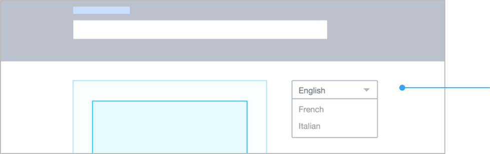
To do so, place your language dropdown outside and use the updateIframeForLang function below to update your iframe.
function updateIframeForLang (langCode) {
    var iframe = document.getElementById ("support-frame");
    var url = iframe.getAttribute ("src");

    if ( !url.match( /\?/ ) ) {
        url = url + "?l=" + langCode;
    } else if ( !url.match( /l\=/ ) ) {
        url = url + "&l=" + langCode;
    } else {
        url = url.replace( /l\=\w+\S/, "", "g" );
        url = url + (url.match(/\&$/) ? "":"\&") + "l=" + langCode;
    }

    iframe.setAttribute( "src", url );
};
updateIframeForLang should be called on click of an item in your language dropdown. langCode is the language code picked from your dropdown, E.g. "en" for English, "fr" for French, and so on.
Since iframe reloads can be slow, this is a good spot to put a loading spinner on #support-wrapper. You can reset the spinner when in the height-change handler, as height change message is also sent when content changes inside the iframe.
Keeping platform selection outside the iframe
In case of in-page embeds, you may wish to keep the platform dropdown outside the iframe.
To do so, place your platform dropdown outside and use the updateIframeForPlatform function below to update your iframe.
function updateIframeForPlatform (code) {
    var iframe = document.getElementById ("support-frame");
    var url = iframe.getAttribute ("src");

    if (code === "all") {
      url = url.replace(/p\=\w+&*/, '');
    } else if ( !url.match( /\?/ ) ) {
        url = url + "?p=" + code;
    } else if ( !url.match( /p\=/ ) ) {
        url = url + "&p=" + code;
    } else {
        url = url.replace( /p\=\w+\S/, "", "g" );
        url = url + (url.match(/\&$/) ? "":"\&") + "p=" + lang_code;
    }

    iframe.setAttribute( "src", url );
};
updateIframeForPlatform should be called on click of an item in your platform dropdown.
The argument code is the platform code, it can have the following values:
- "all"
- Shows FAQs published & visible for all platforms.
- "ios"
- Shows FAQs published & visible for iOS.
- "android"
- Shows FAQs published & visible for Android.
- "web"
- Shows published FAQs.
Adjusting your iframe size on change of content
Iframe size mismatch on navigation
When you embed the iframe as part of your content, you'll also need to re-size it as the user navigates across FAQs and search results.
This is because iframes don't auto-size themselves on change of content. A few FAQ answers or search results might occupy more height than expected, making content clip. Or, a few FAQs or sections might occupy minor height, adding too much whitespace between the iframe and your page's footer.
Content scroll mismatch on navigation
You might notice that upon navigating through FAQ sections & search results, the content doesn't scroll to top adequately enough. This hurts the user experience even more on mobile devices where the looking window is short.
Here's what happens:
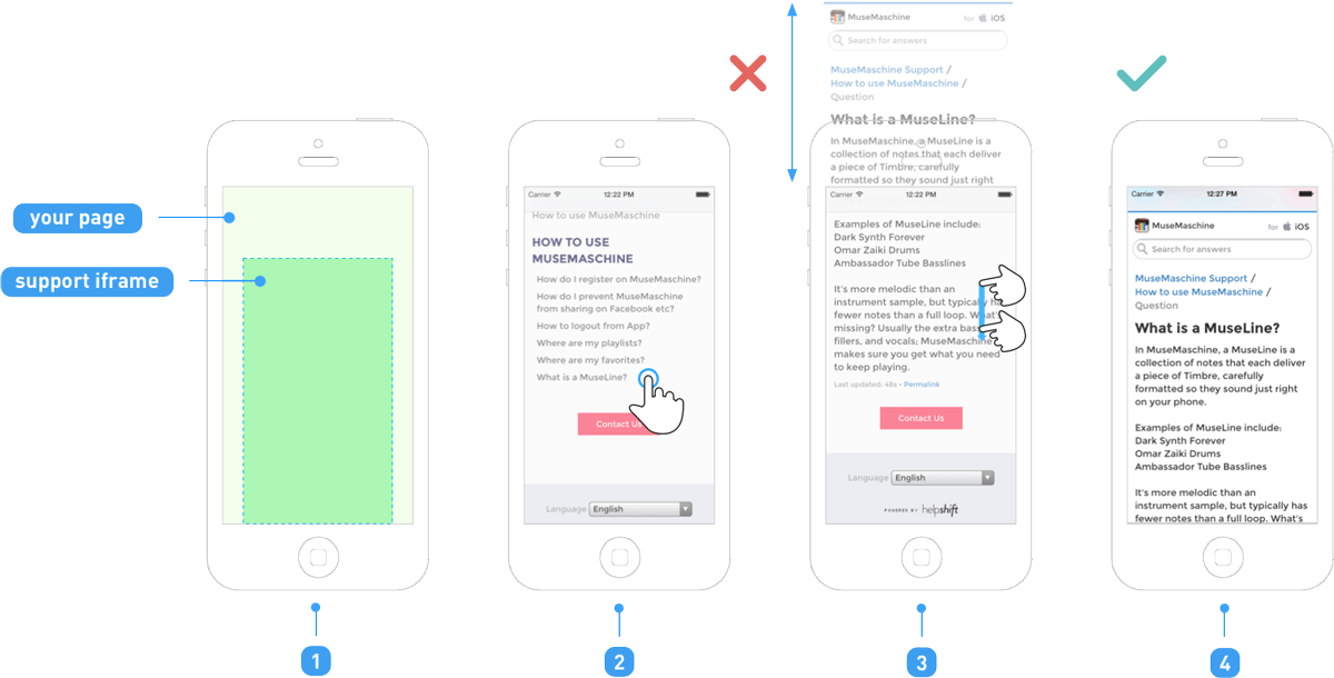
- 1
- Fullscreen or in-page iframe embed.
- 2
- User taps on an FAQ link.
- 3
- User looks at midway content of the FAQ answer.
- 4
- Ideally, for a good reading experience, the page should scroll up to question title.
To fix this, it's a good idea to scroll your parent document to the top, or to a height from which the breadcrumb or FAQ's question will be visible at top.
Adding height & scroll fix to your page
Modify and add this snippet to your embed page to fix the height & scroll issues:
<script>
var _HS = {

    url: "YOUR_DOMAIN.helpshift.com",
    // TODO: change this to your helpshift domain,
    //       e.g. "happyapps.helpshift.com"

    heightPadding: 150,
    // TODO: you will need to change this depending on your
    //       support-wrapper's width

    scrollTop: 0,
    // TODO: Change this to adjust the extent to which you want to
    //       scroll up on change of content. 0 is for topmost.
};

(function (w) {
  w.addEventListener ("message", function (event) {
    if (event.origin.indexOf (_HS.url) !== -1) {
      var msg = event.data.match (/^(?:HS:)(.*)/);
      if (msg) {
        var data = JSON.parse (msg [1]);
        if (data.type === "height-change") {
          document.getElementById( "support-wrapper" ).style.height =
              (data.data.ht + _HS.heightPadding).toString() + "px";
          w.document.body.scrollTop = _HS.scrollTop;
        }
      }
    }
  });
} (window));
</script>