CSS Customization Tutorial
A step-by-step example to help you visualize how to customize your web support portal.
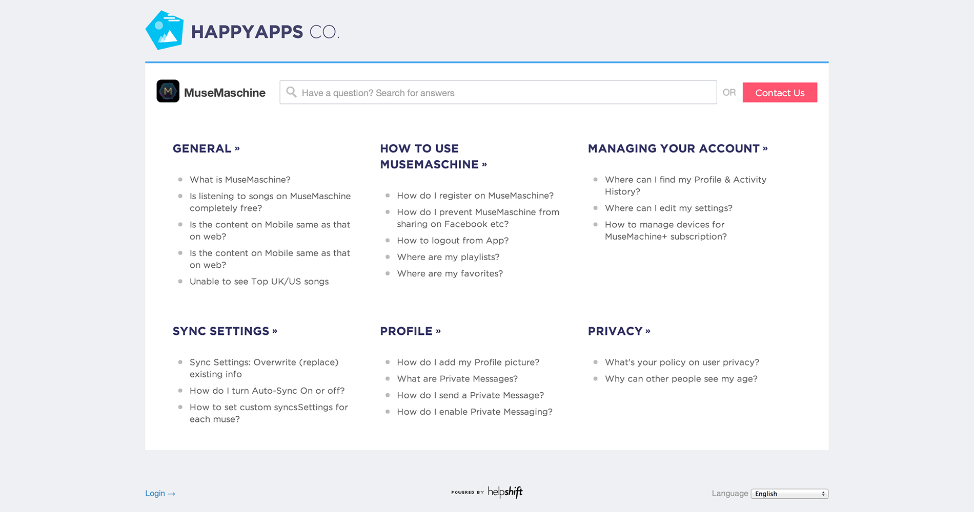
Let's take a fictitious company HappyApps Co. as an example. This is what their design team has in mind for their support portal.
Let's work out how to get there, starting with Helpshift's default styling.
In the snippets below, the green highlight (+) is for lines that will be added by us, and the red highlight (-) is for the lines that will be removed from the custom css.
Fonts, page background, and company logo
The target page is set in Montserrat typeface. Let's import it from Google Web Fonts -
 */

+ @import url(http://fonts.googleapis.com/css?family=Montserrat:400,700);

 /* -------------------------------------------------------
    Layout & General
For page background & using our font, let's modify our "Layout & General" section -
 Layout & General
 ------------------------------------------------------- */


 /* Page's background & text, global font style & size */
 body {
-    background: #e7eaf1;
+    background: #eff0f4;
     color: #444444;
-    font: 16px/1.4 "Montserrat", "Helvetica Neue", HelveticaNeue, Helvetica, Arial, sans-serif;
+    font: 16px/1.4 "Helvetica Neue", HelveticaNeue, Helvetica, Arial, sans-serif;
 }
For adding your company logo, put the asset on one of your cdn/static hosts. In our case, we have it available at http://f.cl.ly/items/3c1j3X3x002g1f1V312G/happy-logo@2x.png. Let's use it:
 /* Page header */
 .header {
-    border-bottom: 1px solid #d7d8db;
+   border-bottom: none;
 }

 /* Company name (h1 tag) */
 .company-name {
     margin-top: 18px;

 /* Un-comment the following to use your company logo. We recommend you keep
    the logo within 45px height */

-/*
     text-indent: -99999px;
-    background: url(path/to/your/logo) no-repeat;
+    background: url(http://f.cl.ly/items/3c1j3X3x002g1f1V312G/happy-logo@2x.png) no-repeat;
-*/

+    background-size: 340px 70px;
+    height: 80px;
 }
We got rid of existing company name in the header with text-indent and added the company logo as a background image. You'll also need to add appropriate background-size and height here so that your logo preserves the aspect ratio.
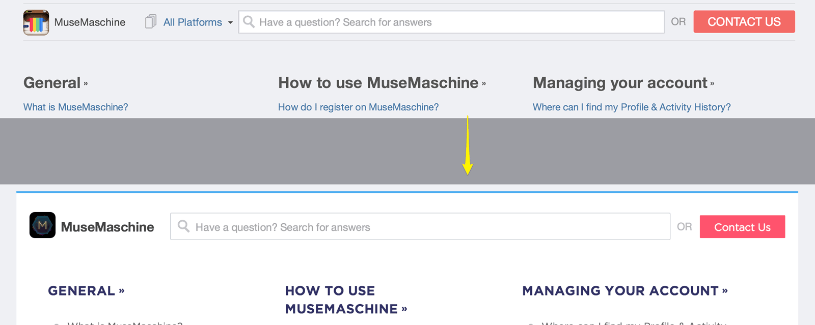
App, platform dropdown, search and 'Contact Us' button
The content below the logo in our new design has a white background and a blue border on top. The wrapper div for app name, search bar and contact button is called actions-wrapper in css.
 /* Container for app & platforms dropdown, the search bar & the contact
    us button. */
 .actions-wrapper {
-    padding: 10px 0px;
-    border-bottom: 1px solid #d7d8db;
+    padding: 30px 20px 10px 20px;
+    background: #ffffff;
+    border-bottom: none;
+    border-top: 3px solid #4facf0;
+    height: 120px;
+}
+
The app name ( MuseMaschine ) is in bold, platform dropdown hidden and 'contact us' button has a different color, normal capitalization -
+.app-dropdown .popover-title-container .title {
+    font-weight: bold;
+    font-size: 20px;
+    padding-top: 8px;
+}

+.platform-dropdown {
+    display: none;
+}

 /* Contact Us button */
 .contact-button {
-    font-size: 18px;
+    font-size: 16px;
     color: #ffffff;
-    background: #F26A67;
+    background: #ff546f;
-    padding: 0px 22px;
+    padding: 4px 22px 0;
     border: none;
+    border-radius: 1px;
+    text-transform: none;
 }

 .contact-button:hover {
     background: #f25350;
Let's make the content below actions-wrapper show up with a white background. We also add some padding to reduce tension between sections and the content wrapper -
/* remove any gap between actions wrapper and content */
.content {
    padding-bottom: 0;
}

.content-wrapper {
    background: #fff;
    padding: 0 48px
}
That pretty much covers our new layout.
Section title and FAQ list on homepage
The new design has a a slightly large section title -
/* Section's title on support page & individual sections */
 .section-title {
-    color: #555555;
+    color: #336;
+    text-transform: uppercase;
+    font-weight: bold;
+    font-size: 20px;
+    margin-top: 20px;
+    margin-bottom: 30px;
 }
The new FAQ links on homepage have gray link color & light gray bullets, let's add that with a css pseudo element -
/* FAQ links on support page & individual sections */
.faq-list li:before {
    content: '';
    display: block;
    float: left;
    margin-top: 6px;
    width: 7px;
    height: 7px;
    background: #bbb;
    border-radius: 50%;
}
.faq-list li {
    margin-left: 10px;
}
.faq-list a {
    font-size: 15px;
    display: block;
    padding-left: 20px;
    color: #666;
}
Search box and lighter 'or' separator
Let's add some more padding and remove shadows from the search box. We also re-position the search icon and lighten out the 'OR' text before contact button -
 /* All questions link under sections */

 /* Search Box */
 .search-input {
     background: #ffffff;
     font-size: 16px;
     border: 1px solid #ccd1d7;
-    padding: 8px 8px 8px 32px;
+    padding: 12px 8px 10px 38px;
+    border-radius: 2px;
+    -webkit-box-shadow: none;
+    -moz-box-shadow: none;
+    -ms-box-shadow: none;
+    -o-box-shadow: none;
+    box-shadow: none;
 }

 /* Search icon color */
 .icon-search {
     color: #c4c4c4;
+    top: 5px;
+    left: 10px;
 }
Since this is plain css, make sure you don't forget to add vendor prefixes.
You'll also need to adjust the search close button since we changed the paddings -
.search-close-btn {
    top: 10px;
}
Are we there yet?
That's pretty much all you needed to get from the default helpshift support portal design to the new one we targeted, for the desktop use case.
But, you'll find a few things misplaced when you load it up on a mobile device -
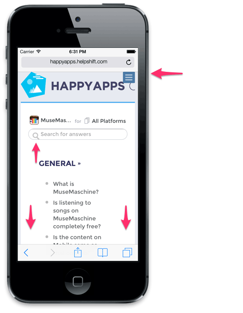
Notice that the content has extra padding, not suited for mobile reading (see how FAQ titles are sqeezed in). The search icon is also a bit misplaced. There's a blue menu (top right), that too displaced.
Targeting mobile browsers
Since we did not wrap our CSS edits in a media query, our changes apply onto all screen sizes - mobile, tablets and desktops alike. Hence the extra padding around FAQ titles, which isn't letting our content be easy to read.
Let's start by fixing the blue menu on top right.
If you've walked across the default css template, you might've noticed a comment on responsive navigation. Let's correct the positioning & color of this menu there -
 /* Responsive navigation menu for mobile devices. If you've altered the
    header size, you can re-position it appropriately here */
 .mobile-nav {
-    top: 0px;
+    top: 24px;
-    right: 0px;
+    right: 4px;
-    background: #4d7ca8;
+    background: #fc546f;
-    color: #bfcedf;
+    color: #ffffff;
 }
Now, you'll also need to correct colors of a few of the menu items. E.g. the "Platform" label and the close button's color. We recommend using Google Chrome's inspector to figure the classes to be overriden -
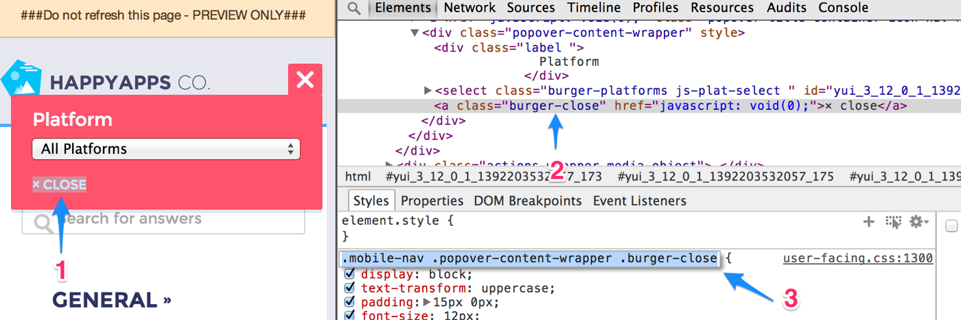
- 1 Inspect
- Right click your customization target, hit 'Inspect Element' in Chrome.
- 2 Study css classes
- Although, it's possible to figure class names via markup, we don't recommend this.
- 3 Pick correct classes
- Picking up class names from 'Styles' panel will work best for you, this won't conflict or be suppressed by existing css.
We need to make both, the 'Platform' label & the close button white, so add these lines below .mobile-nav declaration:
.mobile-nav .popover-content-wrapper .label,
.mobile-nav .popover-content-wrapper .burger-close {
    color: #ffffff;
}
Now we need some css fixes just for mobile form factor, let's target those via media queries -
@media only screen and (max-width: 767px) {

    /* start by fixing the logo size */
    .company-name {
        background-size: 195px 40px;

        /*
           let's position it a bit lower so that it
           doesn't stick to the top
         */
        position: relative;
        top: 20px;
    }

    /* get rid of extra spacing in actions-wrapper */
    .actions-wrapper {
        padding: 6px 8px;
        height: auto;
    }

    /* get rid of extra padding around content */
    .content-wrapper {
        padding: 0 12px 40px 12px;
        margin-bottom: 20px;
    }

    /* adjust some content style */
    .section-title {
        margin-bottom: 10px;
    }
    .column {
        padding-right: 8px;
    }

    /* get rid of dots on left of FAQ list, we want less clutter on mobile */
    .faq-list li:before {
        display: none;
    }
    .faq-list li {
        padding-left: 0;
        margin-left: 0;
    }
    .faq-list li a {
        padding-left: 8px;
    }


    /* adjust the search icon & search input's size */
    .icon-search {
        top: 2px;
        left: 6px;
    }
    .search-input {
        /* you can use !important to enforce a certain property value */
        padding: 8px 4px 7px 32px !important;
    }
}
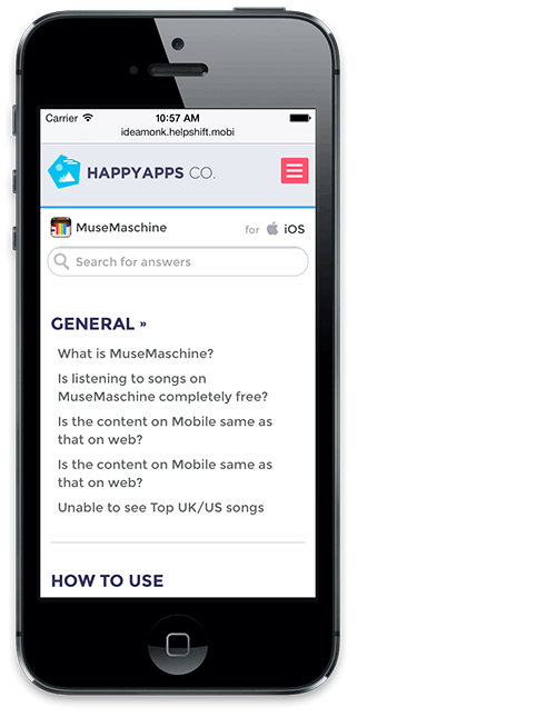
And voila! Our new design works well on mobile too -
Don't forget to test out your support portal on an iPad. If you wish to target something specific for tablets, make sure you wrap such css under this media query -
@media only screen and (max-width: 1024px) and (min-width: 768px) {

    ...

    css for tablets here

    ...
}
If you have questions or feedback, or anything you're stuck with, please Contact Us