CSS Customization
How to deeply custom-brand your Web Support Portal.
Help Center 2.0 does not support CSS customization.
The CSS Editor
Help Center 2.0 does not support CSS customization.
To bring up the Custom CSS editor, navigate to Settings>Web and Email Support and click Customize CSS in your agent dashboard:
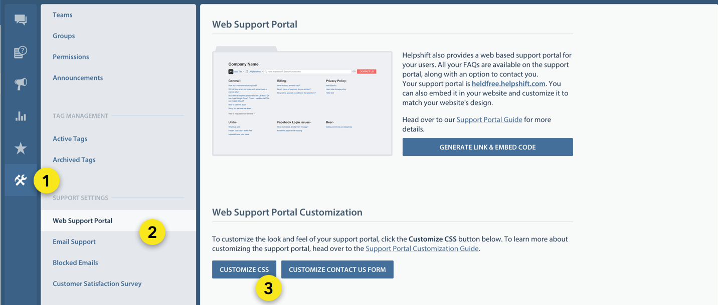
This brings up the custom CSS editor:
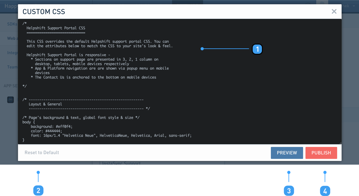
- 1 CSS Editor
- Most of the CSS here is commented out for easy customization.
- 2 Reset to Default
- Use this to reset your custom CSS to the initial default provided by Helpshift.
- 3 Preview
- This will show you a preview of your current changes, in a new tab.
- 4 Publish
- This makes your changes permanent. Your changes are not saved unless you publish them.
CSS Overview
Help Center 2.0 does not support CSS customization.
Support portal comes with a default stylesheet, which looks like this:
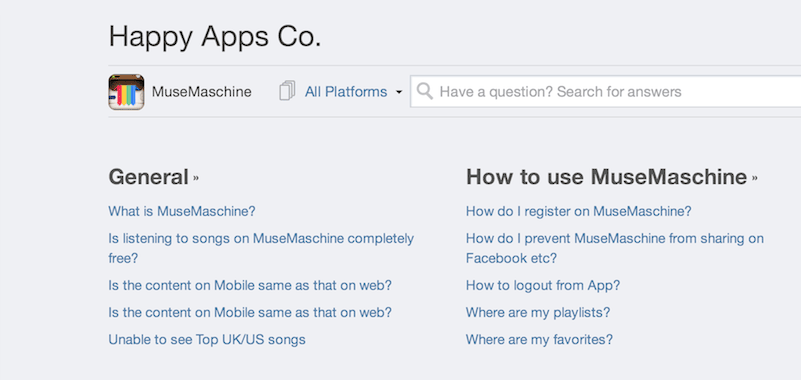
Since this stylesheet is quite big, the CSS Editor exposes the most useful customizations as a starting template.
The styles you override or add in the CSS Editor are loaded after this default stylesheet. This makes it possible for you to modify the looks of virtually any content on the support portal.
As you study the comments in the CSS Editor, you'll find the appropriate places to override desired style changes. If you don't, we recommend using Chrome's web inspector to find out classes to edit.
Follow this tutorial to get familiar with what it is like to customize a web support portal.
Targeting mobile browsers
Help Center 2.0 does not support CSS customization.
Your support portal is mobile responsive, i.e. it is designed with desktop, tablets and mobile form factors in mind. You can see it in action if you re-size your browser or open up your support portal on an iPhone.
So, if you want to modify a certain aspect of your support portal for mobile devices, wrap your css under the following media query:
@media only screen and (max-width: 767px) {
    ...

    css for mobile devices comes here

    ...
}
To target tablets, wrap your css in the following media query:
@media only screen and (max-width: 1024px) and (min-width: 768px) {
    ...

    css for tablets here

    ...
}
It's best to add these media queries at the end of the starter template.
Using external resources
Help Center 2.0 does not support CSS customization.
You may want to use a few external resources in your css, like background images, logos, fonts, etc. We recommend you keep them on a CDN or a place where you host your website's static content from.
Also, make sure that the cross domain policies of your server allow content to be accessible from <your-company>.helpshift.com.
If you might embed the support portal as an iframe on a SSL secured page, we recommend excluding protocols from the URLs in your CSS.
E.g. instead of -
@font-face {
    font-family: "MyCustomFont";
    src: url("http://mycompany.com/static/custom-font.woff") format("woff"),
         url("http://mycompany.com/static/custom-font.ttf") format("truetype");
}
point to resources without protocol -
@font-face {
    font-family: "MyCustomFont";
    src: url("//mycompany.com/static/custom-font.woff") format("woff"),
         url("//mycompany.com/static/custom-font.ttf") format("truetype");
}
We've found it useful when loading fonts on Firefox over HTTPS.
Hiding the contact button
Help Center 2.0 does not support CSS customization.
The steps to show or hide a Contact Us button are changed in Help Center 2.0. To learn more, see link.
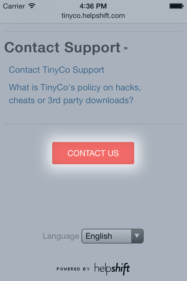
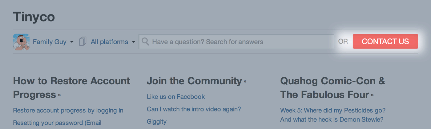
Your web support portal has a contact button to let your customers reach out from the web. Sometimes, you may want to hide the contact button.
You can do this with custom css -
 /* Contact Us button */
 .contact-button {
     font-size: 18px;
     color: #ffffff;
     background: #F26A67;
     padding: 0px 22px;
     border: none;
+    display: none;
 }
 .contact-button:hover {
     background: #f25350;
 }

 /* 'OR' separator between search box and contact button */
 .or-separator {
     color: #999999;
+    display: none;
 }
 ...
This hides the contact button from both desktop and mobile views of the web support portal.
Hiding the contact button only for mobile browsers
Help Center 2.0 does not support hiding the Contact Us button in mobile or desktop browsers exclusively. Its visibility is either turned on or turned off.
To hide the contact button for mobile browsers, and keep it available on desktop, make these changes:
 /* Style the contact us button for mobile devices.
    Note: it gets anchored to to bottom of the page */
+
+.mobile-report-wrapper {
+  display: none;
+}
+
 .mobile-report-wrapper .contact-button {
     font-size: 14px;
 }
 ...
Hiding the contact button only for desktop
Help Center 2.0 does not support hiding the Contact Us button in mobile or desktop browsers exclusively. Its visibility is either turned on or turned off.
To hide the contact button for desktop browsers, and keep it available on mobile, make these changes:
 ...
 .or-separator {
     color: #999999;
 }
+
+@media only screen and (min-width: 768px) {
+    .contact-button {
+        display: none;
+    }
+
+    .or-separator {
+        display: none;
+    }
+}
+
 /* Style the contact us button for mobile devices.
 ...
Replacing an app icon via custom css
In its initial release (c. May 2021), Help Center 2.0 does not support any method to replace an app icon. However, we expect to add this capability in a subsequent maintenance release.
Sometimes app icons may not show up on your web support portal. For example, this might be the case when your app isn't on an app store. Or let's say it's a web app with no store icon.
-
In the top navigation and app dropdown on web support page
-
In the app dropdown within the Contact Us modal
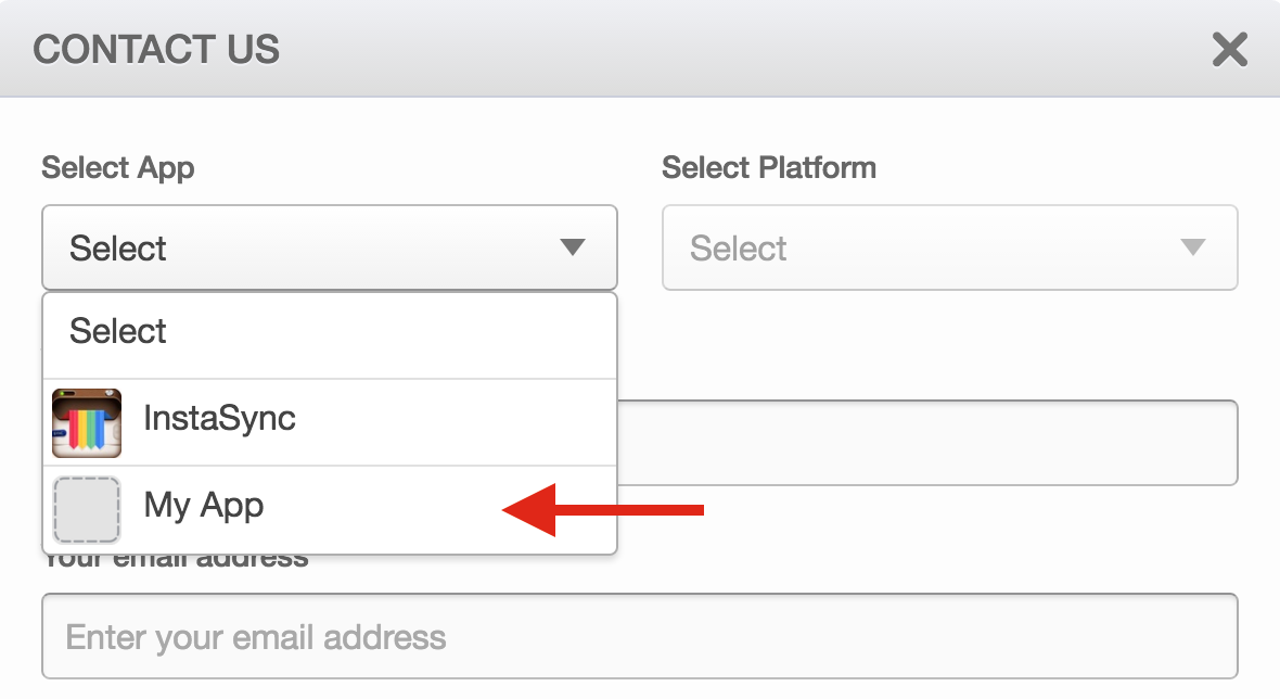
-
On mobile browsers, at the page's header
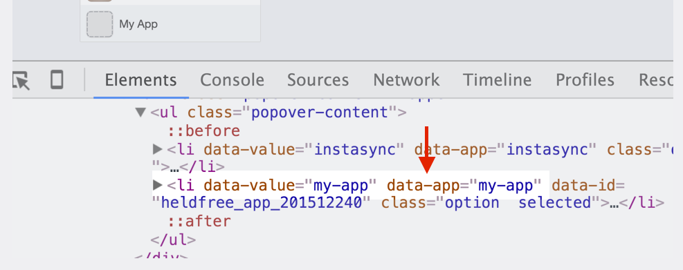
To replace the icon, you'd need know the app's data-app value.
It can be simply figured by lower casing the app's name and replacing all spaces with hyphens.
E.g. if the app is called My App, value of data-app will be my-app.
To replace the app icon on the web support portal's top navigation and app dropdown, add this code to your custom css -
.app-navigator .popover-title img[data-app="my-app"] {
    width: 0 !important;
    height: 0 !important;
    padding: 20px !important;

    background: url(YOUR_APP_ICON_URL_HERE);
    background-size: cover !important;
}

.app-dropdown li[data-app="my-app"] img {
    width: 0 !important;
    height: 0 !important;
    padding: 20px !important;

    background: url(YOUR_APP_ICON_URL_HERE);
    background-size: cover !important;
}
You should also replace the icon when your support portal is opened on a small display, say a mobile browser -
.actions-wrapper .app-selection .app-icon[data-app="my-app"] {
    width: 0 !important;
    height: 0 !important;
    padding: 12px !important;

    background: url(YOUR_APP_ICON_URL_HERE);
    background-size: cover !important;
}
To replace the app icon on contact us modal app dropdown, add this code to your custom css -
#report-issue-modal .field-app-dropdown li[data-app="my-app"] img,
#report-issue-modal .field-app-dropdown[data-app="my-app"] .dropdown-title img {
    width: 0 !important;
    height: 0 !important;
    padding: 16px !important;

    background: url(YOUR_APP_ICON_URL_HERE) !important;
    background-size: cover !important;
}
That should let you over-ride the app icon when they're not available.
If data-app is difficult to figure out, you can use an inspector to look into the markup -
App specific customizations
The steps to customize the look and feel per mobile app are changed in Help Center 2.0, and no longer involve direct CSS manipulation. To learn more, see link.
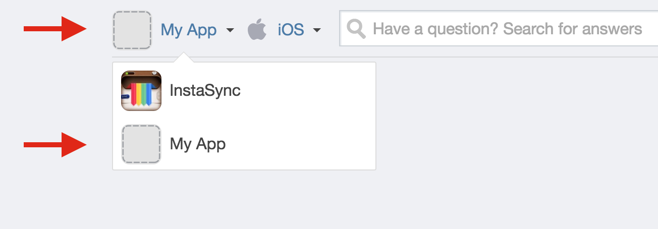
Let's say you have 2 apps.
You may wish to make your web support portal look slightly different for each app.
This is possible by targeting <body> by id attribute in your custom css.
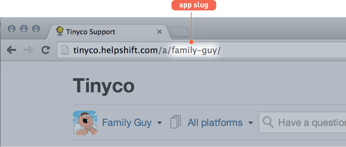
The id attribute of <body> tag is always set to app-{ app slug } -
The id is also updated when your customer switches between the apps.
So, let's say the slugs for your two apps are family-guy and tiny-poker.
And, you want to apply a sky blue background for the Family Guy FAQs, but a green background to the Tiny Poker FAQs.
You can target the two apps and end of your custom CSS -
body#app-family-guy {
    background: SkyBlue;
}

body#app-tiny-poker {
    background: green;
}
This would make the page background sky blue whenever customers view FAQs for Family Guy, and green for Tiny Poker.
Remember, if you change your app's nickname from agent dashboard, the app slug will also change. In which case, you must update these pieces of custom css to the latest.