Helpshift’s Legacy SDKs (SDK Version <=7.x.x) will see end of life as of 31 Dec 2022 and end of support as of 31 March 2023.
Skinning & Customization
Learn about Skinning the Helpshift SDK to match the look-n-feel of your app. Customize localizable strings to support multiple languages in the SDK UI.
Introduction
If you want to customize Helpshift SDK theme as per your app's theme, see Theming and Skinning
If you want to change strings used in the SDK's UI or want to translate them as per device language, see String Customization.
Theming and Skinning
For theming of Helpshift SDK v3.12.0 and below refer theming and skinning older SDKs.
Helpshift Android SDK comes with following themes -
- Helpshift.Theme.Light.DarkActionBar (default)
- Helpshift.Theme.Light
- Helpshift.Theme.Dark
- Helpshift.Theme.HighContrast
- Helpshift.Theme.DayNight.DarkActionBar
- Helpshift.Theme.DayNight.Light
- Helpshift.Theme.DayNight.HighContrast
 |
 |
 |
 |
|---|---|---|---|
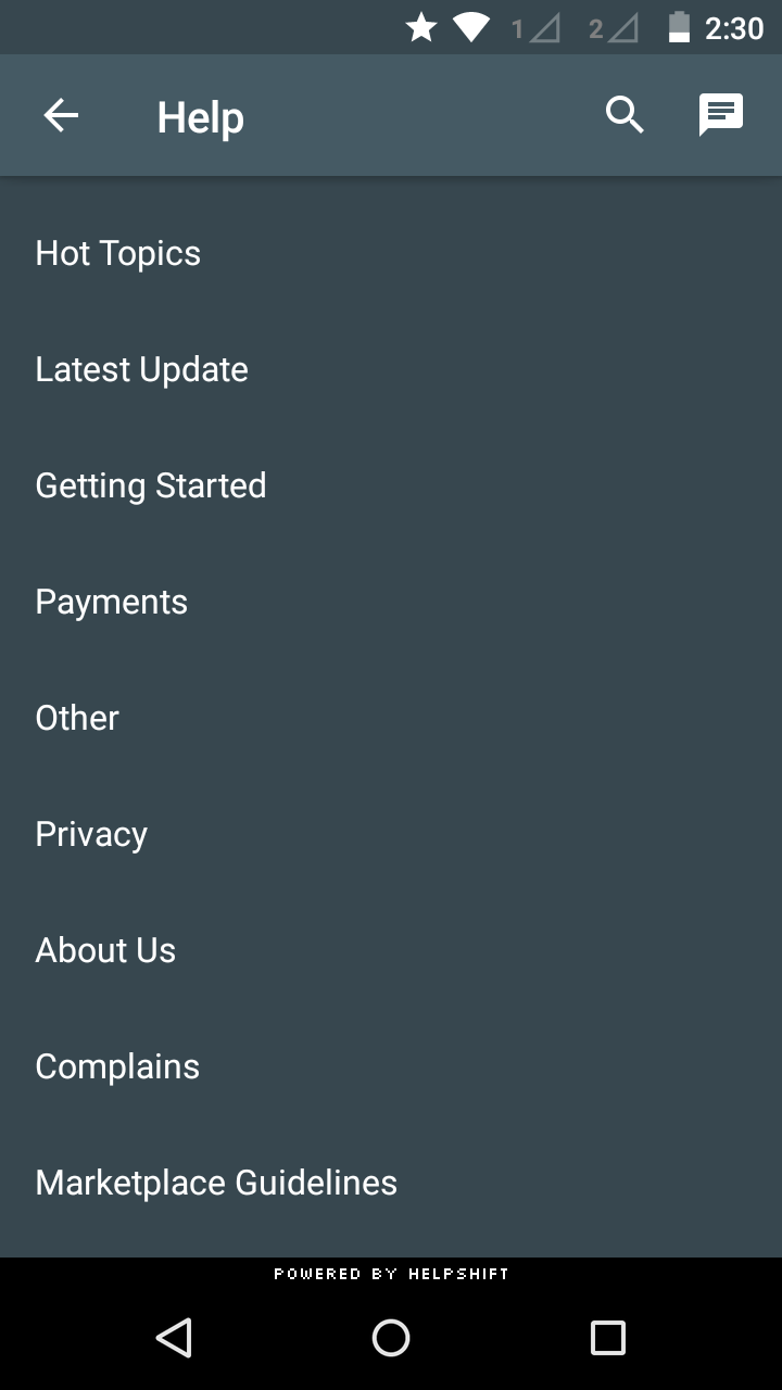
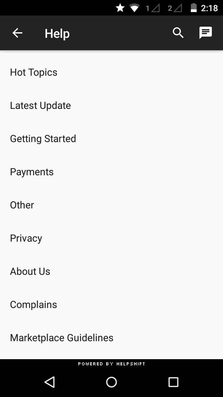
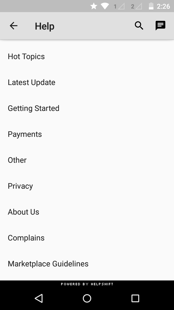
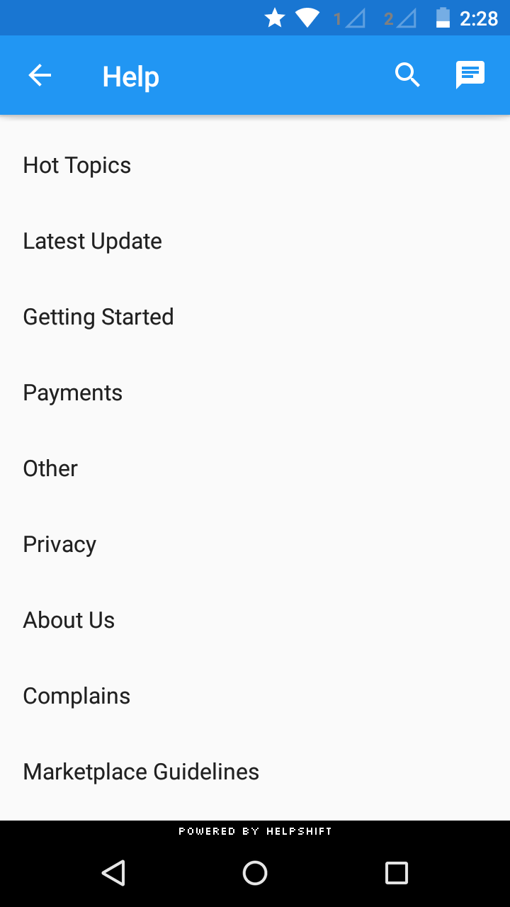
| Helpshift.Theme.Dark | Helpshift.Theme.HighContrast | Helpshift.Theme.Light | Helpshift.Theme.Light.DarkActionbar |
To make the Helpshift SDK look like your app, please follow the steps given below -
- Define your custom helpshift theme in your styles.xml and inherit it from one of the Helpshift themes mentioned above.
- Create a style named Helpshift.Theme.Base and set its parent to your custom helpshift theme.
For example:
You can give the Material look and feel of your app to Helpshift SDK by customizing very few attributes as follows:
<style name="MyCustomHelpshiftTheme" parent="Helpshift.Theme.Light.DarkActionBar">
    <item name="colorAccent">@color/your_custom_color</item>
    <item name="colorPrimary">@color/your_custom_color</item>
    <item name="colorPrimaryDark">@color/your_custom_color</item>
</style>

<style name="Helpshift.Theme.Base" parent="MyCustomHelpshiftTheme"/>
You can customize Android's styleable attributes along with Helpshift's styleable attributes.
Helpshift styleable attributes
| Field | Summary |
|---|---|
| colorPrimary | The primary branding color for the app. |
| colorPrimaryDark | Dark variant of the primary branding color. |
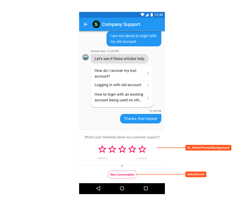
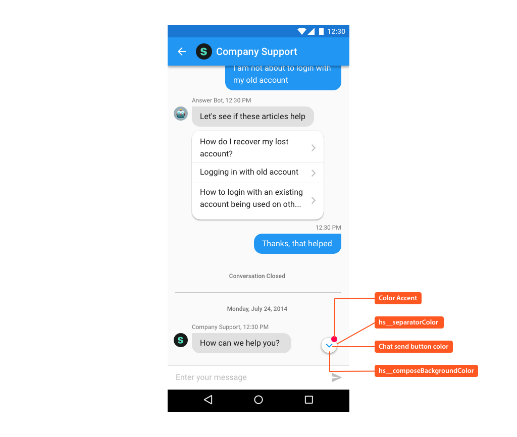
| colorAccent | Bright complement to the primary branding color. |
| titleTextColor | Color of the Toolbar title string. |
| navigationIcon | Drawable to use for the navigation button located at the start of the Toolbar (back button). |
| homeAsUpIndicator | Drawable to use for the 'home as up' (back button when SearchView is expanded) indicator. |
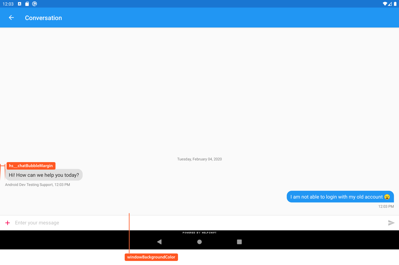
| android:windowBackground | Drawable to use as the overall window background. |
| android:textColorPrimary | The most prominent text color. |
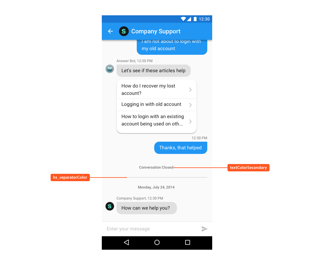
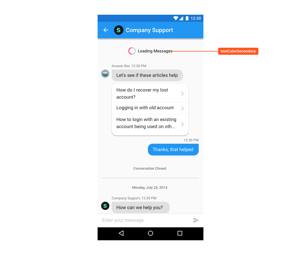
| android:textColorSecondary | Secondary text color. |
| android:textColorHint | Color of hint text (displayed when the field is empty). |
| hs__tabTextColor | Color of the text in a tab on FAQ section pager screen. |
| hs__tabSelectedTextColor | Color of the text in the selected tab on FAQs section pager screen. |
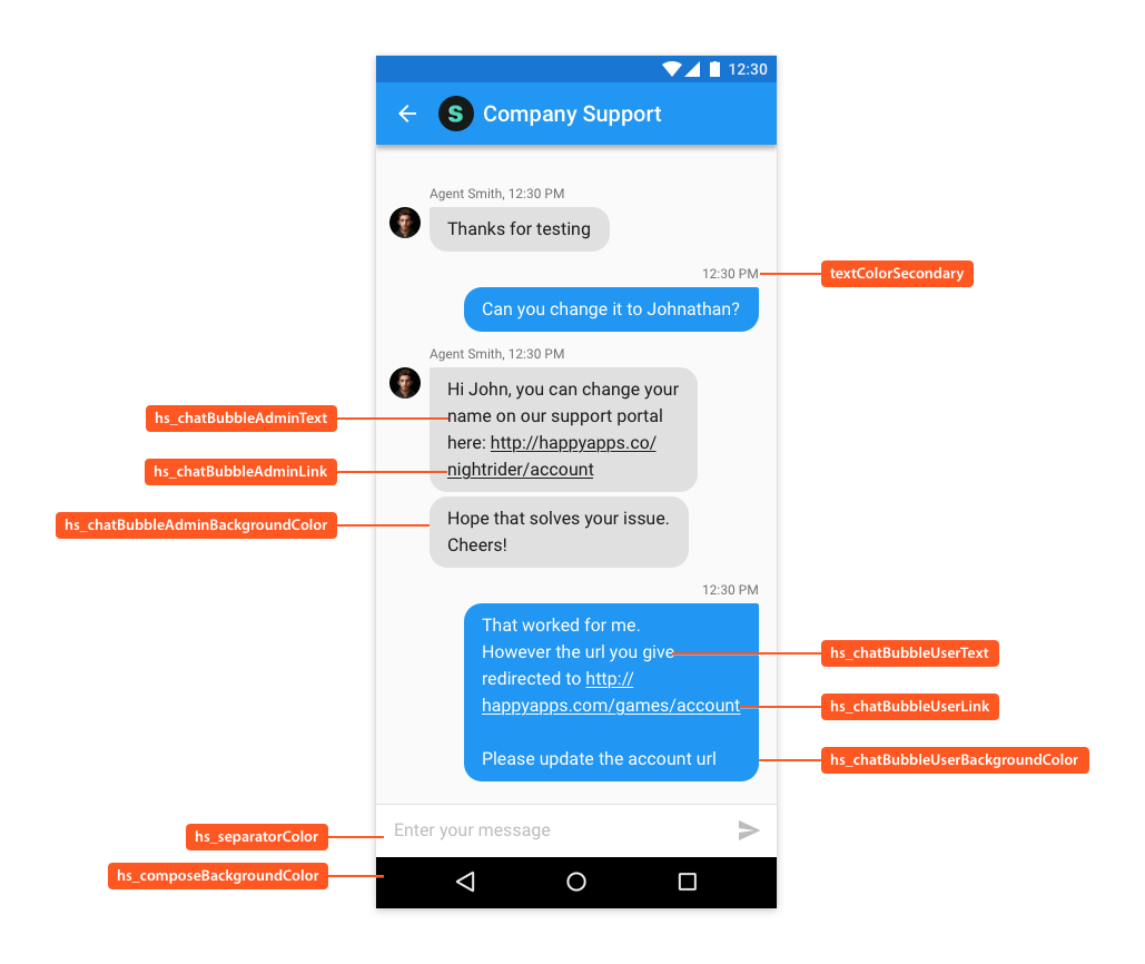
| hs__chatBubbleUserText | Color of user text in conversation. |
| hs__chatBubbleUserLink | Color of links in user's text in conversation. |
| hs__chatBubbleUserBackgroundColor | Color applied to the background of user message bubble |
| hs__chatBubbleAdminText | Color of admin text in conversation. |
| hs__chatBubbleAdminLink | Color of links in admin's text in conversation. |
| hs__chatBubbleAdminBackgroundColor | Color applied to the background of admin message bubble |
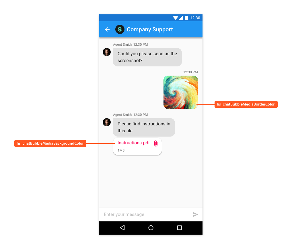
| hs__chatBubbleMediaBackgroundColor | Color of the background shown in the attachment message or QuickSearch Bot FAQs message bubble. |
| hs__chatBubbleMediaBorderColor | Color of the border shown in the attachment message bubble. |
| hs__composeBackgroundColor | Color of the active send button on conversation screen. Background color of the jump to latest message button. |
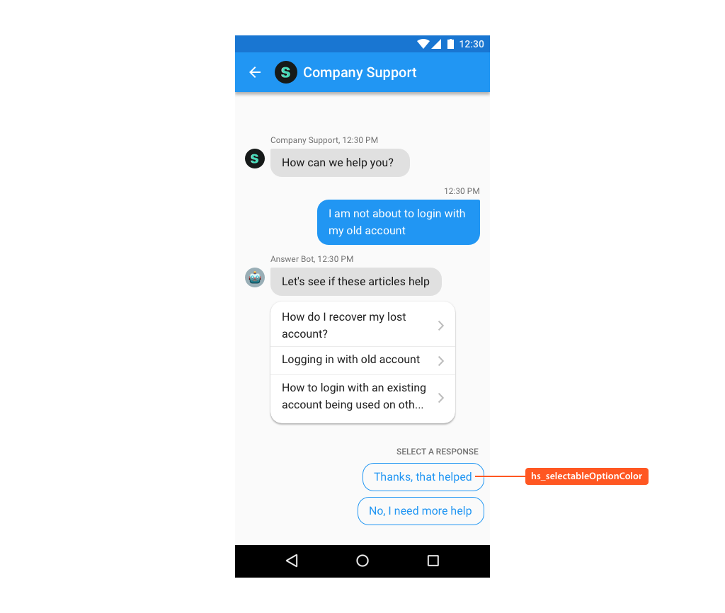
| hs__selectableOptionColor | Color of the text in option pills of QuickSearch Bot or skip button. Color of the jump to latest message icon. |
| hs__typingIndicatorColor | Color of typing indicator shown in Conversation screen |
| hs__attachmentBackgroundColor | Color used as background for attachment meta data info while filing new issue. |
| hs__separatorColor | Color of horizontal or vertical separators in the SDK. |
| hs__searchHighlightColor | Color the highlighted text in search results. |
| hs__footerPromptBackground | Color of footer background in FAQ and Conversation screens. |
| hs__expandedPickerIconColor | Color of collapse (down arrow), search, clear, back icons in the list picker's expanded mode. |
| hs__collapsedPickerIconColor | Color of expand (up arrow) icon in the list picker's collapsed mode. |
| hs__messageSendIcon | Icon for button used to send a message in conversation screen. |
| hs__searchOnNewConversationDoneActionButtonIcon | Icon for button used to close FAQ screen in form based search results flow. |
| hs__startConversationActionButtonIcon | Icon for button used to start a new conversation in form based flow. |
| hs__conversationActionButtonIcon | Icon for button used to open a conversation on the FAQ screen. |
| hs__searchActionButtonIcon | Icon for button used to start a search in FAQ screen. |
| hs__attachScreenshotActionButtonIcon | Icon for button used to attach an image on the conversation screen. |
| hs__faqTextColorLink | Color of links in FAQ content. |
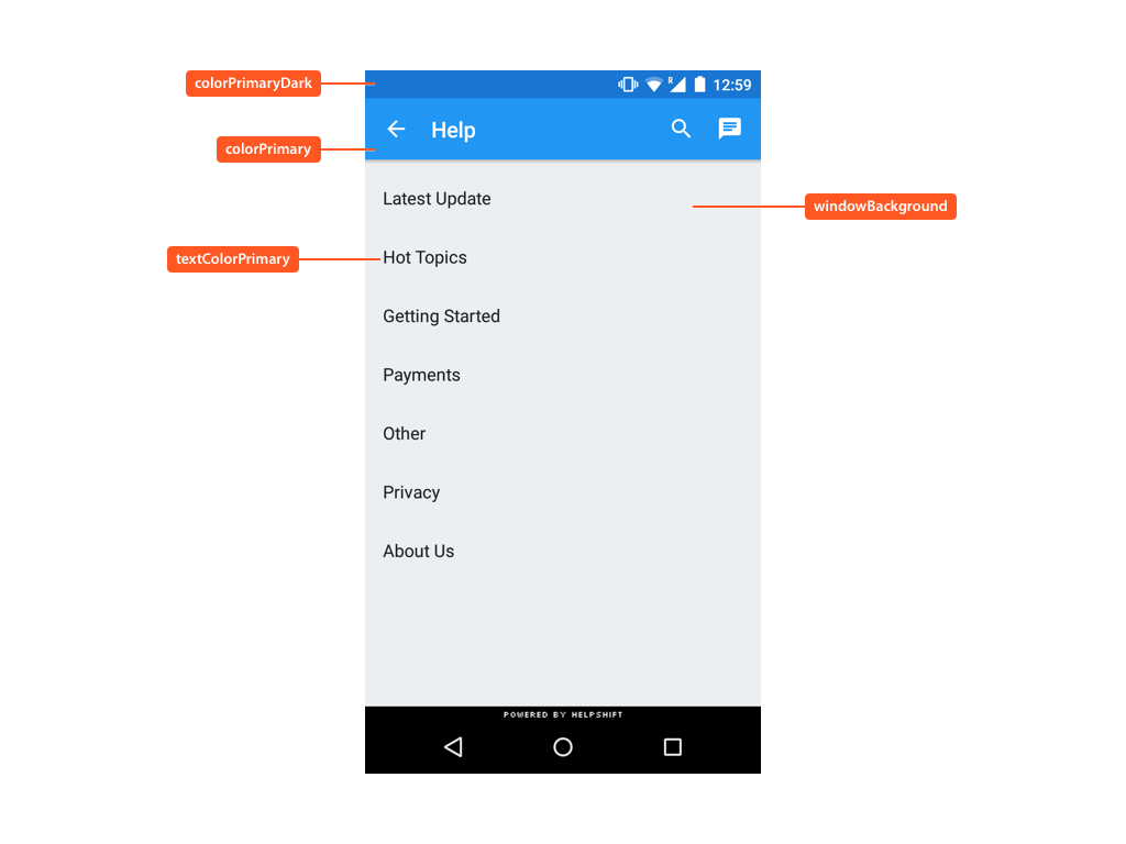
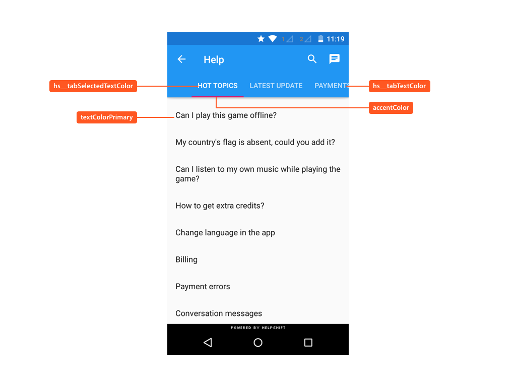
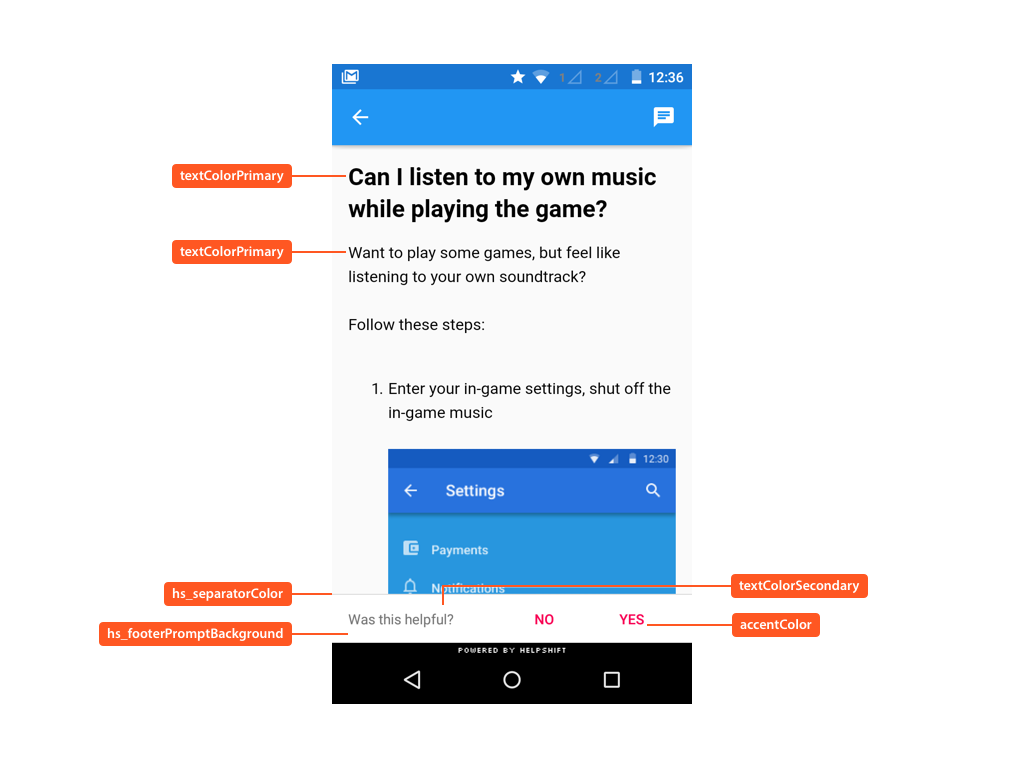
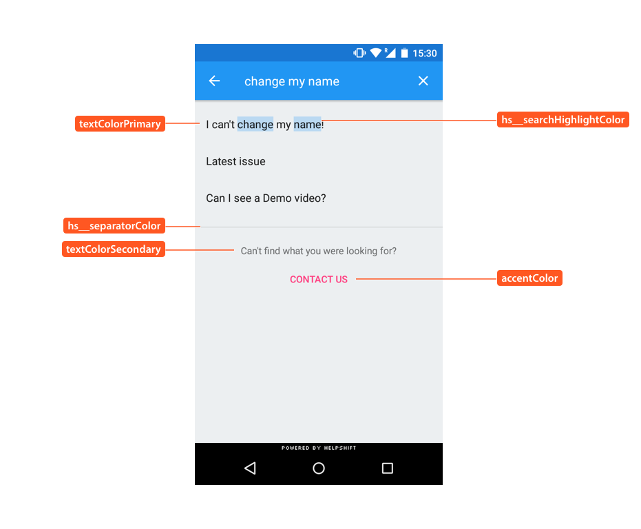
Styleable attributes in action
The following illustrates use of these styleable attributes over Helpshift SDK's UI:
Helpshift dimensions
You can use the following dimension to change certain aspect of the SDK. These dimensions are independent of the theme set for the SDK.
For example:
<dimen name="DIMENSION_NAME">VALUE</dimen>
| Dimension | Summary | Default value |
|---|---|---|
hs_support_recyclerview_item_vertical_padding |
Top and bottom padding of each item in the Recyclerview Item. Any value less than 16 is ignored and will have no effect. This affects the Recyclerview Item used for FAQ list, FAQ sections list and search results | 16dp |
hs__chatBubbleMargin |
Left and right margin on the message chat bubbles in conversation screen | 16dp |
Changing theme at runtime
From SDK version 7.6.3 onwards, SDK provides the ability to set a theme for all Helpshift SDK screens at runtime. This theme needs to inherit one of the Helpshift themes. To set the theme, you need to pass a theme resource value as the parameter. For example:
Core.setTheme(R.style.custom_theme);
You can reset an existing theme to the default theme declared for the Helpshift activity by passing 0 as the theme resource id parameter. For example:
Core.setTheme(0);
Dark Mode support
From SDK version 7.6.3 onwards, SDK supports dark mode theming. To enable the dark mode switching feature, you need to create a theme by inheriting one of the Helpshift.Theme.DayNight themes in your app:
- Helpshift.Theme.DayNight.DarkActionBar
- Helpshift.Theme.DayNight.Light
- Helpshift.Theme.DayNight.HighContrast
Customizing the dark mode themes
You can customize the dark mode theme just like you would customize any other Helpshift theme like below:
<style name="MyCustomHelpshiftTheme" parent="Helpshift.Theme.DayNight.DarkActionBar">
    <item name="colorAccent">@color/your_custom_color</item>
    <item name="colorPrimary">@color/your_custom_color</item>
    <item name="colorPrimaryDark">@color/your_custom_color</item>
</style>
<style name="Helpshift.Theme.Base" parent="MyCustomHelpshiftTheme"/>
Enable/disable dark mode switching at runtime
To enable or disable dark mode switching at runtime programatically, use the Android API referred here.
Orientation support
By default, the Android SDK will obey the orientation of the device. If the device rotates to landscape mode, the SDK will update its UI to landscape orientation. Rotating back to portrait mode will bring the UI back to portrait orientation.
Lock the Helpshift SDK window to landscape/portrait mode :
Use one of the following solutions to lock the Helpshift SDK window to landscape/portrait mode, irrespective of the app's orientation.
Using screenOrientation config (supported from v4.9.0) :
You can programmatically set the orientation for the Helpshift SDK using the screenOrientation install configuration, documented here. This config takes precedence over the orientation set in AndroidManifest.xml.
By specifying the orientation for Helpshift Activity in AndroidManifest.xml :
If you are using gradle :
Add the Helpshift activity to your app's AndroidManifest.xml file with the
attribute android:screenOrientation="landscape" or
android:screenOrientation="portrait" as given below.
<activity
    android:name="com.helpshift.support.activities.ParentActivity"
    android:theme="@style/Helpshift.Theme.Activity"
    android:screenOrientation="landscape" />
This will merge the screenOrientation attribute to the activity in Helpshift's AndroidManifest.xml file.
If you are using ant build / Eclipse based project:
Locate the AndroidManifest.xml file in Helpshift project and add
attribute android:screenOrientation="landscape" or
android:screenOrientation="portrait" to Helpshift's ParentActivity in AndroidManifest.xml file.